Peer Assessment of Flat Plan
Amy said that the image is the main part of the front cover and catches the attention of the reader, so it is important that the image is relevant to the content and target audience so they will be more interested in the magazine and more likely to read the magazine. The model in the photo needs to be similar to the audience in relation to clothes and overall image too.
The photo is a medium close up which I think helps the audience relate to the model as the costume and model will be as similar to the target audience itself. This should interest the readers more as it usually does when they can relate to something or think they have things in common with something or someone.
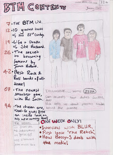
I have had some feedback about the contents page, saying that the picture should be more prominent, however i think it will be and it just doesn't look as major in the drawing as it will be when taken on a camera, so i am not currently worried about this. However I can now ensure that the picture stands out when I take the actual photo for the contents page. The layout of the contents page only gained positive remarks, as it is easy it follow and not to busy so readers can easily follow the important pages and the most popular areas of the magazine. There is also not too much writing on the contents page so it isn't boring, however a reasonable level ensures the contents page looks professional and does it's job.
Amy said that by looking at my double page spread, you get the idea that when produced properly it will look very professional, with the initial attention of the reader being drawn to the large close up on the fore page, then the article coming from this on the opposite side. The outline of the double page spread shows that there will be a reasonable balance between images and text. The readers attention will not be lost by the use of too much text and will hopefully be maintained through the use of relevant images, in-keeping with the rest of the article, contents page and front cover.
Amy said that by looking at my double page spread, you get the idea that when produced properly it will look very professional, with the initial attention of the reader being drawn to the large close up on the fore page, then the article coming from this on the opposite side. The outline of the double page spread shows that there will be a reasonable balance between images and text. The readers attention will not be lost by the use of too much text and will hopefully be maintained through the use of relevant images, in-keeping with the rest of the article, contents page and front cover.


No comments:
Post a Comment