Welcome

Welcome to my blog. Here you will find research and planning, construction evidence and evaluation for my AS foundation portfolio.

Tuesday, 24 April 2012

Evaluation Question 7: Looking back at your preliminary task, what do you feel you have learnt in the progression from it to the main task?


Research
In my preliminary task, I did very little research. I just looked at a front cover and a contents page and tried to copy them without looking into the methods used and the process it was carried out in. 
For the main task I researched much more thoroughly, and looked at the techniques and methods used by the professionals to ensure my magazine was much higher quality than the prelim. I researched the target audience and audience profiles more when doing the main task, so that I knew what sort of things to include and elaborate on. 
I used the internet to collect secondary data about my audience; what their interests are, how other media producers produced magazines and what the genre of music represents. The research was time consuming but  crucial to the high standard completion of my final main product. 
Planning  
Planning my final product was carried out over a number of weeks. I needed to ensure I had done specific things before I started my product. I planned my final product by taking photography test shots, receiving feedback of flat plan, researching models costume, location recce, photo shoot plans, article draft, photo shoot, model release forms, model roll call sheets, location hazard and risk assessments.  

Friday, 30 March 2012

Evaluation Question 6: What have you learnt from technologies from the process of constructing this product.

I have learned about using a range of technologies. From the construction of my magazine i have learned how to use an Apple Mac, and how to use software packages such as InDesign, ghotoshop, goanimate and Prezi. From using photoshop to create my magazine cover, it allowed me to layer objects such as the sell-lines on top of the image.
I have also learned how to use a professional camera as shown in the photo above. I had to learn how to change the settings, the flash lighting and also learn how to use applications such as focus and zoom to ensure my photographs used were as professional as possible. This along with my chosen model also helped me portray the audience type and relate to my chosen audience.

Thursday, 29 March 2012

Evaluation Question 5

I conducted some final audience feedback with your target audience. 


The evaluation was completed with 6 questions for the audience to follow during the video. These people were asked:
  • What draws your attention to the product?
  • What genre is it and how do you know?
  • What do you consider are the strengths of the product?
  • What social groups does it represent and how?
  • Would you purchase the product and why?
  • How would you improve the product?


Monday, 12 March 2012

Evaluation Question 4

Following secondary research in the initial stages of my project, I found the audience of my magazine was people between the ages of 18 and 30 and thew audience profile for these people would be trendies and indie scenesters. I then conducted primary research which suggested the same. Therefore this would be who my magazine would be aimed at and they would would be the audience for my media product.


This image would be a perfect example of a 'trendy' the look of the man in the picture would be the type of person that may be expected to relate to the sell lines and the image on the front cover.

Saturday, 10 March 2012

Evaluation Question 3 - What kind of media institution might distribute your product and why?

The Production Process:
Producing my media product would go through a production and publication phase, which follows five main steps:
- creative ideas, the genre, the magazine image and the chosen audience.
- look into current oppositions and products already on the market, in comparison to my own media product and how/why are they successful?
- create flat plans as a visual aid as to what the product will look like, making it easier during production process
- constructing the product on an industrial size
- distributing the product to either a large audience, depending on my chosen audience, commercial or independent?

Thursday, 8 March 2012

Evaluation Question 2 - Construction


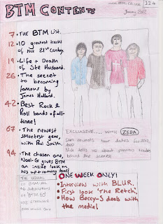
As you can see the initial prelim is not to the standard of the front cover just before completion. My skills using technology and a camera are obviously much better than they were previously. There have been more skills used and a wider range of technology to ensure the better quality completion. 
The fonts i have used as well as shot composition have improved a lot. 


Tuesday, 6 March 2012

Evaluation Question 1 - Research and planning

My skills have improved since the start of the year making it easier and easier to complete my media assignments. I am now much more capable with Photoshop, InDesign, the Camera's and lighting props used with them.I believe that my work was more in line with professional pieces as over time and assessments I have gained a greater knowledge of methods used by professional magazines. My work was planned better as i managed my time better, however i think this area of my work still needs improvement.  


Tuesday, 21 February 2012

How to improve my blog

The feedback I have received has given me an understanding of the things I need to change, implement or improve. Here are the suggestions from my teacher:

Prelim flat plan and evaluation needed.
Textual analysis needs developing with path on prezi.
Discuss magazine in institutional research.
Target audience research - more detail and find another magazine audience profile
Primary research - what each video highlights
Article planning - more info needed
Own rationale for your flat plans + have audience research after.

Thursday, 9 February 2012

Moodboard of inspirational facial expressions


This moodboard shows a range of facial expressions, all of them are serious and professional looking and give me a good indication as to what type of image I would like to have on my front cover and what facial expression they will have.

Model Release Forms

These are my two model release forms for the models I will be using for the images in my magazine. This gives me consent to use them in my magazine.


Call Sheets


Amy Scowen
Age 16
Will feature in my contents page


Nick Hazlet
Age 17
Will feature on my Front Cover


Steven Husband
Age 18
Will feature on my DPS

Test Shots

Following my research and feedback on my ideas I decided to take some test shots to have a look at different poses that I could use for my magazine.


Print Production Risk assessment + Hazard Evaluation


Wednesday, 8 February 2012

Recce of location


This is the photography studio and is my recce of location. This is where my images will be taken for my magazine, I think that this will be a good location as the pictures will look very professional and I will not have to worry about whether the location will fit in with the context of the magazine as it will be very generic and in-keeping with the magazine.

Flat Plan Analysis

Peer Assessment of Flat Plan

Amy said that the image is the main part of the front cover and catches the attention of the reader, so it is important that the image is relevant to the content and target audience so they will be more interested in the magazine and more likely to read the magazine. The model in the photo needs to be similar to the audience in relation to clothes and overall image too. 
The photo is a medium close up which I think helps the audience relate to the model as the costume and model will be as similar to the target audience itself. This should interest the readers more as it usually does when they can relate to something or think they have things in common with something or someone.
I have had some feedback about the contents page, saying that the picture should be more prominent, however i think it will be and it just doesn't look as major in the drawing as it will be when taken on a camera, so i am not currently worried about this. However I can now ensure that the picture stands out when I take the actual photo for the contents page. The layout of the contents page only gained positive remarks, as it is easy it follow and not to busy so readers can easily follow the important pages and the most popular areas of the magazine. There is also not too much writing on the contents page so it isn't boring, however a reasonable level ensures the contents page looks professional and does it's job.
Amy said that by looking at my double page spread, you get the idea that when produced properly it will look very professional, with the initial attention of the reader being drawn to the large close up on the fore page, then the article coming from this on the opposite side.  The outline of the double page spread shows that there will be a reasonable balance between images and text. The readers attention will not be lost by the use of too much text and will hopefully be maintained through the use of relevant images, in-keeping with the rest of the article, contents page and front cover.


Planning my article

I will be trying to interact with my audience closely and relate to them by using 2nd person.
I will be using language that the readers will understand and will not be too intellectual for them
and will be detailed as well.
I believe that if i use very formal language the readers will be bored and it will not be in keeping
with the format and genre of the magazine.
 I believe that if the reader can relate to what is being said and the writer more, they will enjoy
reading the magazine much more.
I will keep the language as generic as possible throughout so it flows easily and the attention
of the reader is maintained well from start to finish.


Thursday, 26 January 2012

Primary Research


These are the questions I asked:
What do you think the genre of the magazine is and why?
What do you think about the fonts used and why?
What don't you like about it and why?
What do you think of the photo's and why?
What do you think the target audience is and why? 
 

From the feedback I received, I gained a better understanding of what was thought of the front cover, contents and double page spread. A comment that was reiterated was that the magazine seemed mainstream.

Monday, 23 January 2012

Target Audience Research. Magazine Audience Profile


The magazine I am looking at is NME. The shot above shows the reader profiles of this magazine. It is more popular amongst males, with 69% of the audience coming under this heading. The statistics show that the average age of the readers is 24, with 52% of them being in full time work, 29% still studying and 7% working part time. There areMost of their readership come under A,B and C1 with a percantage of 65% which shows that their readers will be willing to spend money on NME as the social classes ABC1 are usually wealthy. The magazine has a readership of 369,000 and a circulation of 40,948.


Institution and Distribution

Q magazine is owned by

Bauer Media: http://www.bauermedia.co.uk/

Also 'Mojo', 'Kerrang' and many other music magazines are owned by this same company. The company focuses on producing music magazines but do a lot of different ones so they are able to research the different types of music.

It is beneficial to own the rights to many magazines and a range of magazine styles, such as different music types and genres. Also magazines that aren't music related but perhaps sport or fashion related. These music companies will have experience in comparing and relating different music types to show contrast positively and promoting their magazines with correct and thorough information that certain target audiences may be interested in. This would make the magazines more popular and would ensure the audiences remain interested and impressed with the content of the magazines. 


Textual Analysis

Friday, 13 January 2012

Brief; print

Preliminary exercise: using DTP and an image manipulation program, produce the front page of a new school/college magazine, featuring a photograph of a student in medium, close-up plus some appropriately laid-out text and masthead. Additionally you must produce a mock-up of the layout of the contents page to demonstrate your grasp of DTP.

Main Task: The Front Page, contents and double page spread of a new music magazine. A minimum of 4 images must be used, all images and graphics must be produced by the Candidate.